Blog
Responsive Web Design : The bridge between your business and customers
With tremendous growth in numbers of smart phone users and tablet users in Australia, mobile is taking a center stage in building and maintaining business-customer relationship.
 With tremendous growth in numbers of smart phone users and tablet users in Australia, mobile is taking a center stage in building and maintaining business-customer relationship. The smart phone and tablet revolution has brought a whole new mobile era for both end users and businesses. There are estimated 9 million smart phone users in Australia and the number is expected to hit 12 million mark this year and will continue to propel in coming years. These smart phone users are not just smart phone users but are backbone of bolstering Australian e-commerce industry!
What this means for your business?
The growing numbers of smart phone and tablet users clearly indicate that it is not just about Mobiles, it's about mobility! If you give them right way, you can drive them straight to your business! Give them a smooth, easy and interactive web experience while they are surfing your business website from their mobile or tablet and they are more likely to be turned into your customers rather than just website visitors. But how? How to give mobile and tablet users a smooth web experience? The answer is Responsive Web Design.
What is Responsive Web Design
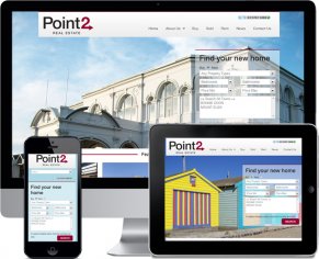
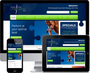
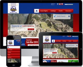
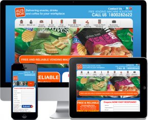
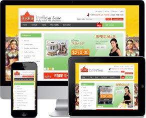
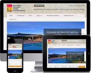
Responsive Web Design is a web design approach in which website is designed and developed in such a way that it renders its design or look in a uniform and flexible way on all screens including mobile, tablets and fablets. Why Responsive Web Design?
Non-responsive website can not render all the content of a web page on mobile or tablet screen in a flexible way, there will be hidden content on the screen that you will need to scroll to if you want to see that part of the content. While this seems okay to you as a business entity, it looks quiet irritating and time consuming to your website visitor. Because mobile and tablet internet users surf web on the go and along with other activities, they are always in a hurry to find the information they want through your website, and if your website makes them scroll left and right to find the desired content, the are sure to leave your website and never return to it.
And this is where Responsive Web Design helps! If you have a responsive website, it will show up in mobile or tablet in such a flexible way that no content will be hidden from the screen and user will not have to scroll through left or right side to see the content. This, on the one side helps them save their time and find the desired information quickly through your website and on the other hand it also gives them smooth web experience which increases chances of them coming back to your website in future and thus, develops a relationship between them and your business.


